top of page
Ride Sharing Analysis


Technologies Used: Python, Pandas, Matlab, Seaborn, Jupyter Notebook
Summary: Analyzed ride sharing data to understand the relationships between city types, average fares, drivers, and total number of rides.
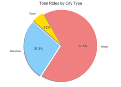
Imported and merged data from multiple sources. Created a dataframe on average fares, total rides, and total drivers by city. Produced a dynamic bubble plot (sizing based on total number of drives). This graph allowed us to understand the relationship of all four variables in one snapshot: average fares(y axis); total number of rides(x axis); city type(color/legend); drivers per city(dynamic sizing of bubbles). Also created pie charts on Total Fares, Drivers, and Riders by City Type.
 |  |
|---|---|
 |  |


bottom of page